Been doing trees in different media on the evening class. Has been a good opportunity to revisit something old and try something new.
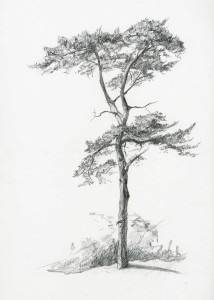
Did the Scots Pine in pencil and was inspired by having done some machine embroidery so trying to get my marks to look a bit like that. Turned out quite well. I then floated it on a background of handmade paper in photoshop. Gives it a different feel altogether.
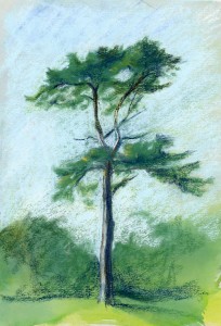
Then I tried some soft pastels which I have had for ages but hardly ever use. I reread a book by John Blockley. He uses pastels in a way I really like. He simplifies his images and tries to concentrate shapes, rendering them in pastel which is not routinely rubbed. Sometimes he uses really bold watercolour washes to bring an extra dimension to the image and provide interesting and varied tones in the background. The results are really liveley.
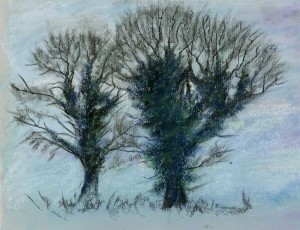
My first attempt is OK and at least not over worked. The winter trees are not as successful, probably not really the right media. An interesting challenge though and again not too over worked which I am prone to. The colours in both are not too muddy either and definitely aided by watercolour washes.

0 Comments